
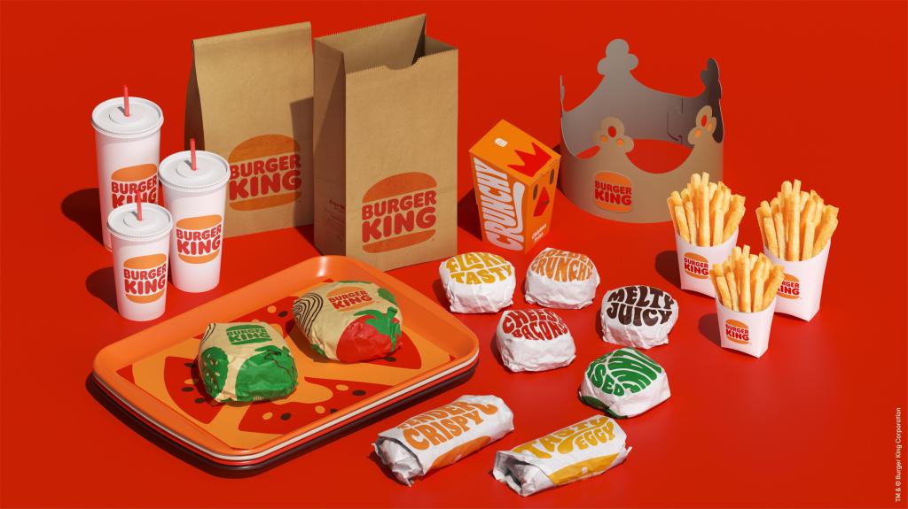
Burger King announced a new look and feel this week. The blue “swoosh” they incorporated end of the 90s is dropped and the brand returns to the logo set up used 30 years until 1999.
I first visited a Burger King outlet somewhere early 80s. They did not have “kids burgers” yet, but they still announced your order through the microphone then. Whoppers all around, with or without cheese. Somehow the logo was imprinted on me, the two buns with the word “Burger King” in between. So much so, that when I saw the new designs, it somehow didn’t look altered and I had to check the logo that was used until then. That’s pretty powerful.
It is being described as retro, but I would argue that they returned to their iconic logo, which also shows what Burger King is about: burgers. No features or swooshes, instantly show the benefit. This logo was everything it needed to be, like so many other brand logos that have been designed in the previous century. During the 90s, a lot of brands added some sort of MTV twist to it, a TV fashion concept which is a hard time explaining to current youth. Recent years have seen more brands revisiting designs and even advertising concepts and pay-offs from the 70s and 80s era. Obviously, there are brands who have never changed their logo, sticking with what is best and sure isn’t broken, like Coca-Cola.
The power of design relies amongst others heavily on font usage. This all has to do with the thing called “priming”. Our brains are wired to box in memories and images, to quickly sort through incoming impressions to give them meaning and place them in a bespoke set. We are primed to respond to certain elements, so that our brains can process more quickly. Knowing this, and great designers and art directors know this all to well, brand or product logos need to adhere to certain primed codes. If I were to take a $40 bottle of Moet & Chandon, and replace the label with a bubbly colorful font, the same bottle suddenly has a value of $3. We expect certain visual cues to help us navigate our search and manage our expectations.
Logo and product design are essential for building a brand. It is the first thing we see and look for as consumers. It needs to tie into the brand values and image laid out, have its right place in the category it intends to compete in and should be useful for a longer period of time for continuity’s sake. With that in mind, I’m so glad the Burger King people did not go for the logo they wielded during the 60s. Now that would have been retro!
Steering a design agency into a direction is no easy feat. You need to have your own homework done to explain them what the desired outcome will be. They need to have a good understanding of what is driving you and your brand. It is not always instantly conceived either, design hierarchy comes into play and before you know it, you’re gasping for air. Struggling with an upcoming brand portfolio design or update? Give me a call, Whoppers are on me.

Leave a comment