

I remember sitting in a university classroom with another 300 students during a marketing course. The topic of that lecture showcased how to be mindful of cultural differences and gave the example of how a “before and after” outdoor ad went wrong as in that specific country, they read from right to left verses our left to right. Product introduction was a total bust. The lecturer laughed, we all laughed. Fun story.
It is striking though to see how so many ads are messed up even within our own left to right world. Somehow it doesn’t take cultural differences to mess up an ad. It takes people who don’t know what they’re doing. Obviously, ads may pan out differently than you expected or hoped, as there is always a component called “magic” to it. But in terms of layout, there is no magic, only a harsh reality.
We read from left to right and from top to bottom. At least, here in the western part of the world. So, one starts a page top left and exits bottom right. Between those two steps are top right and bottom left. Pretty straightforward. It is the Z -pattern.
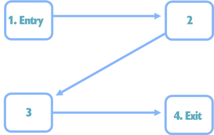
Western people with their Z-pattern reading are inclined to let their eye go from top left to bottom right. It has been hammered into us since birth. Knowing this, top right and especially bottom left are thus given less attention. This is not rocket science and hopefully it also does not sound unfamiliar. Top left and bottom right are prime realty in a visual. People scroll at glance through the ad and are imprinted with the brand’s name or logo as the last thing they absorb. Pretty easy.
All said, for one reason or another, some marketers and their designers still manage to put the brand logo in the bottom left corner, the place the eye looks at least. Or even worse, having some legal disclaimer in the bottom right corner. Cause that was the vital thing you wanted to get across instead of your brand name or logo. It is a waste of the time, effort and resource you put into your advertising. And you do not need to be creative or artistic yourself to review an ad to spot this.
But you know all this, this is not about you. It is other marketers. So let’s throw another curve ball at ya: converging tangents. This is an amazing design flaw, which once you start seeing it, will make so many agencies go nuts. According to Chris Schweizer, a tangent is when two or more lines interact in a way that insinuates a relationship between them that was not intended. It can create confusion on the part of the audience as to what it is that they’re looking at. Most of all, it creates a decidedly unwelcome aesthetic response: tangents are just plain ugly.
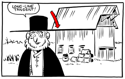
I couldn’t have phrased it any better. Tangents are what continuity errors are in films. Your mind spots it and cannot process it like it wants to do, thereby creating a subliminal frustration. Worst case, the entire ad is cast aside by the brain. Another campaign wasted. Lot of times you may go like, “Well, I kinda like it, not entirely though but cannot put my finger on it.” Odds are, it is not that you do not get the intention of the visual or see how well it fits in your campaign strategy, but there is just something wrong with it. This could very well be a tangent messing up the homerun that should be the ad. Happens a lot of times with ads where multiple products are lined up. To put you at ease, it happens all the time, to the best agencies in the world. It is a joined task to spot them in draft phase and make sure it never sees the published light of day.
These design basics work everywhere, from an outdoor to designing a website homepage. In the end, it is not as a marketer about having an affinity with design or being a guru yourself in Photoshop. It is about the basics. Knowing the underlying principles of design makes you a better marketer, better at briefing, reviewing and conversing with your agencies. If you see opportunities for you and your team to incorporate this in your way of working, drop me a line. Let’s do coffee. My email address is on the bottom right of this article.
lennart@boorsch.com

Leave a comment